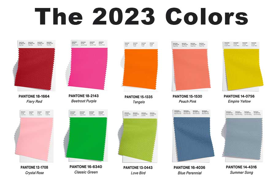
Each year, the Pantone Color Institute carefully selects a color of the year. Before that however, they narrow it down to a palette that they ultimately choose from. The Pantone Palette 2023 caught many eyes at New York Fashion Week, and it’s not hard to see why. Let’s take a look from a home design point of view…
Meet the Palette
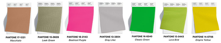
To say this palette is bright and bold would be an understatement. The ten fabric swatches emulate cheer, fun, and a ton of personality that could be showcased in a space in your home. The palette covers nearly the entire rainbow, but remember, they’re not all meant to be used in the same place at the same time.
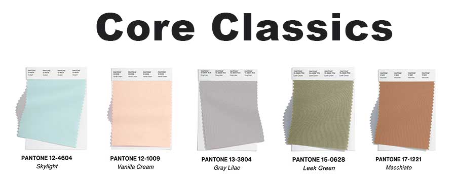
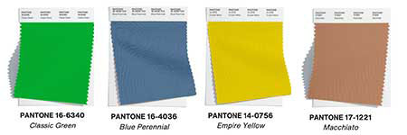
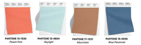
In addition to this vibrant palette, the “Core Classics” are a bit more colorful than usual too. Often, these classics released by Pantone are neutral, but this year we’re seeing muted colors that make a great transition from all-neutral to a bit of soft color.
The Pantone Palette 2023 in Home Design
The home design world is always eager to see the release of this infamous palette each year. The Pantone Palette 2023 is going to help keep interior spaces light, bright, and with an upbeat atmosphere. We know not everyone is naturally drawn to bold and bright colors, that’s why we’re bringing you a collection of photos of dreamy spaces to help you imagine how these colors can be used in both big and small ways.
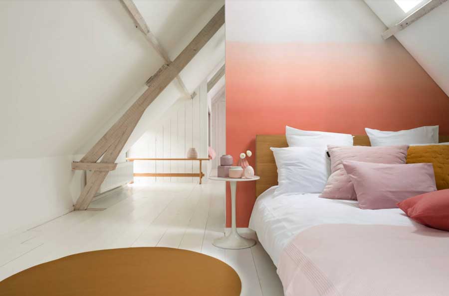
Bedrooms
Your bedroom should be the exact atmosphere you desire. Some people prefer darker tones to mimic the relaxation you can feel at night, while others prefer a lighter space to make popping out of bed in the morning that much brighter. No matter your preference, the right colors can create that atmosphere and those feelings for you.

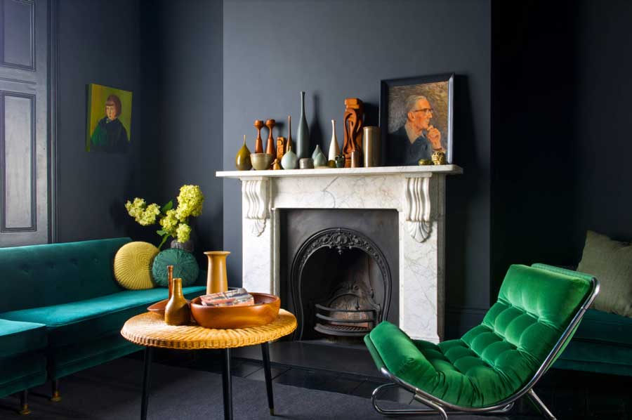
Living Rooms
Talk about adding color in a BIG way! Look at this dramatic, moody living room. The deep jewel tones play well with each other and create a space great for relaxing in. Adding in the few pops of white and yellow help to keep the space soft amongst the deep wall color.
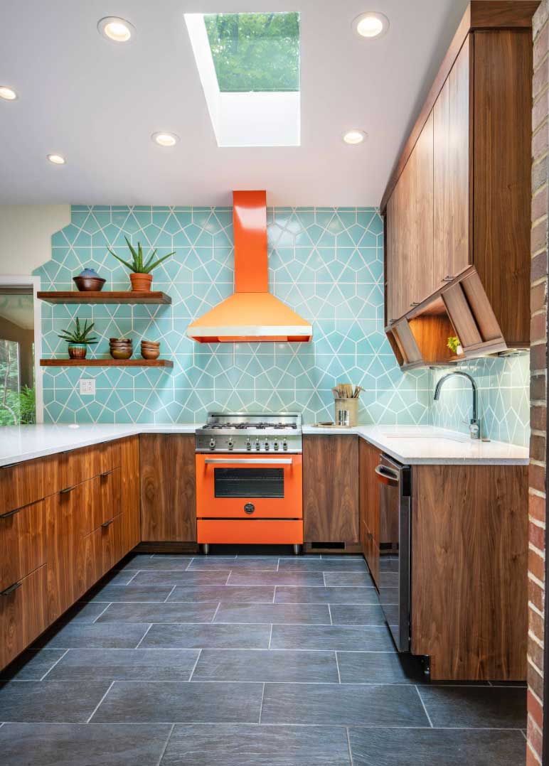
Kitchens
Don’t shy away from color in the kitchen! Kitchens should be the heart of the home and remain a place of inspiration and comfort. Adding in some color, rather than keeping it all neutral like we’ve often seen in years past, brings so much life into this space for you and your family to gather and make lifelong memories.
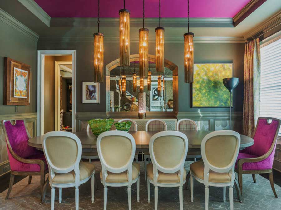
Dining Rooms
This dining room shows how to take color to a whole new level. The ceiling, the walls, the chairs, the dramatic lights… We love it all. Dining rooms often get lost in the shuffle of home decorating and people don’t focus on it since it’s not always used in every home. Perhaps, with the right design choices, you would feel more drawn to spending time in your dining room with family and friends.
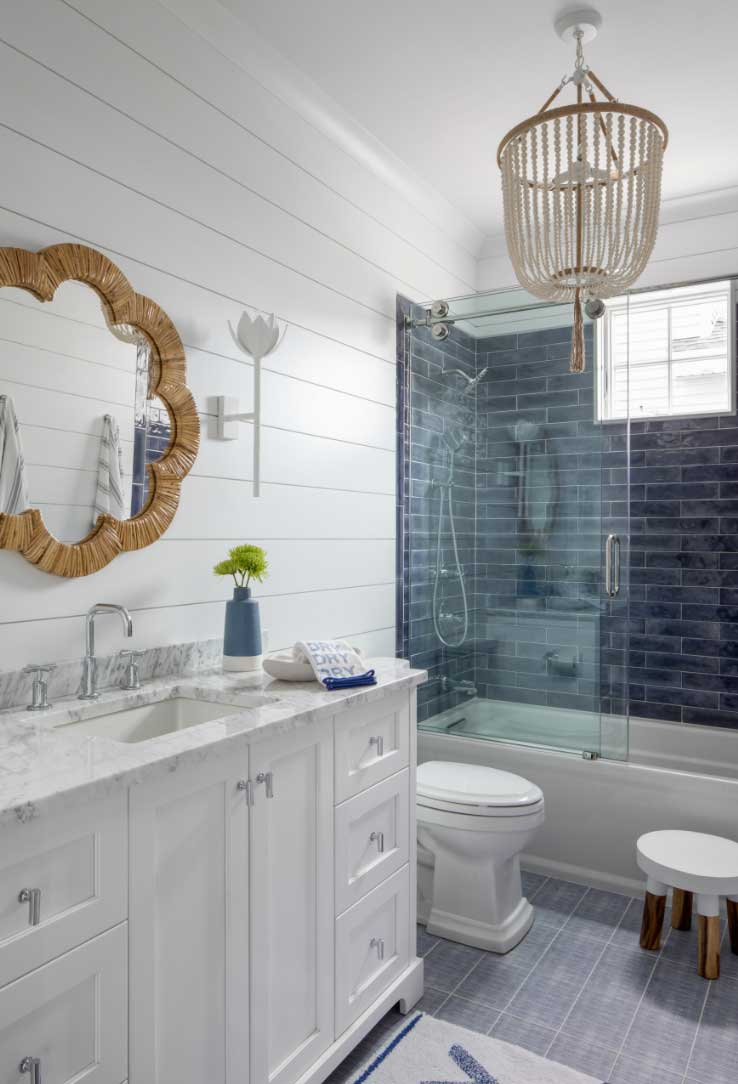
Bathrooms
Bathrooms are a place that are frequented every day in a home. It’s important your space feels calming and fresh to you so that starting your day–and ending it there–feels right. Look how this pretty blue tile brings in some color, while the white walls keep it refreshing. What’s not to love about coastal feelings we get from this design? After all, who doesn’t love a good beach vacation?

The Pantone Palette 2023: Which Are Your Favorites?
We introduced you to a lot of hot design colors today, which ones are your favorites from the Pantone Palette 2023? Whether you’re seeking out a throw pillow or two for a small pop of color, or want to go big by painting your ceiling like we saw in the dining room…these colors will help completely transform your home. Our designers are here to help and always look forward to a good remodel project. Contact us today for your FREE consultation.