
December is busy with holiday festivities, but it’s also the month when Pantone, the leading authority on color, announces its decision for the coveted title of Color of the Year. The choice for the coming year–or more accurately, choices–has created quite the uproar in the fashion and design world. That’s right. Pantone selected TWO colors to share the spotlight in 2016: Rose Quartz and Serenity. Pastel shades of pink and blue, this color pairing is a huge departure from Pantone’s announcement of bright Radiant Orchid in 2014 and deep Marsala in 2015. While many are jumping to conclusions about the political and cultural implications of Pantone’s decision, we’re here to tell you what you really want to know: how to incorporate the Color of the Year into your Kansas City area home’s decor.
A Little Color…A Big Impact
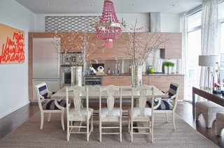
If you’re not ready to paint the walls and overhaul a space, try using small pops of the Color of the Year pairing. This dining room is a great example of how just a little bit of color can make a big impact. If this room had only neutrals, it might be a bit bland and dull. With a few colorful pieces, though, it feels both cheerful and sophisticated. As the obvious showpiece of the room, the pink chandelier radiates energy and joy, and the branching pink florals continue to spread that feel throughout the space. The blue striped chairs bring a level of refinement, but they don’t take away from the room’s vibrancy. Are you imagining how hints of Rose Quartz and Serenity could transform your home? From draperies and upholstery to art and accessories, we’re sure to have just what you need to bring your ideas to life.
More Contrast…More Beauty
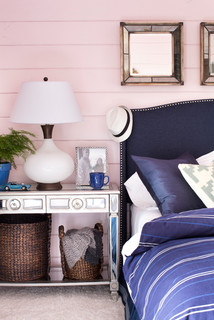
If you’re longing for a fresh look, try embracing the contrast of 2016’s Color of the Year duo. While it might seem contradictory, the contrast of warm Rose Quartz and cool Serenity blue truly does create harmony. Filling this bedroom, pink and blue bring soft beauty along with a sense of well-being, composure, and respite. They also hold the essence of childhood while joining for a contemporary and mature look. Such contrasts can work to beautify your home too. If you love the upholstered headboard, pale pink paint, or custom bedding seen here, let us know! We have decorating products like these that are perfect for achieving the look and feel you want.
Get Inspired…Go Bold
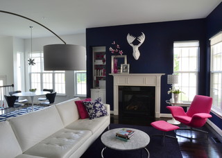
If pastels aren’t your thing, then go bold! No one’s stopping you from using Pantone’s idea of contrasting pink and blue with vivid shades. In fact, every year designers all over the world come up with their own personal take on how to use the Color of the Year to inspire their work. The creator of this living space backdropped it with dark blue and then carefully chose decor elements–like the white faux deer head and hot pink chair–for a result that is nothing short of fabulous! And with the ample light this open-concept space receives, they chose roller shades–simple in both function and design–that won’t take away from the look of this home. If you’re inspired, our selection of custom furniture, accessories, window coverings, and more can help you find your own way of using the Color of the Year to design a space that’s all yours and everything you want it to be.
Anticipation is mounting for what’s to come out of the fashion and design industry in 2016 because of Pantone’s unprecedented announcement of two colors for the Color of the Year. We’ll be on the lookout for how Rose Quartz and Serenity make their way into next year’s clothing lines and interiors. But, we’ll also be on the lookout for you! Our team at One Stop Decorating would love to help you incorporate the soon-to-be-trending combination of pink and blue into your Kansas City area home. Contact us today for a free, in-home consultation to get started!